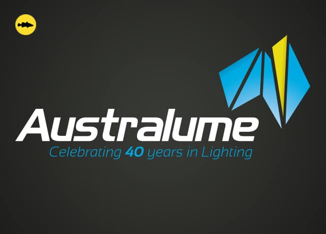
How we (literally) brightened up Australume’s logo

What we’re working on: We were asked to give Australume’s 40-year-old logo a subtle update while keeping it recognisable. We took the essence of the original, which is a map of Australia expressed in shards of light, and wove in a fresher colour palette plus a clean new font. A spot UV finish helped drive home a message of brilliant light. Stepping away from the screen was essential for this project, which began as a pencil sketch on a notepad.
Why it matters: A brand refresh is an exciting way for businesses to show change, progress. In fact, there are few big-name brands that haven’t evolved over time. We were honoured to be invited to make a difference for this trusted and established firm.
How this can help you: A project like this takes some investment in time and resources; in this case, it took 3 weeks after starting before we were ready to roll out the new-look logo on Australume’s stationery, marketing materials and website. But the marketing ripples generated have been worth it already.
What our client says: “After deciding to use Funky Barramundi to redesign our company logo, we had the confidence in Angelo to transform an outdated logo into something bold, eye catching and modern. Throughout the entire process, it was evident that Angelo possessed a passion for creativeness. The use of colours and simple but effective design nailed the brief. He was open minded yet intuitive which made the design process a breeze. Since launching the new logo, we have received wonderful feedback and I will have no hesitation to use Funky Barramundi for future projects” – Liana Kontista, CEO Australume www.australume.com.au

