PRB Real Estate’s brand evolution


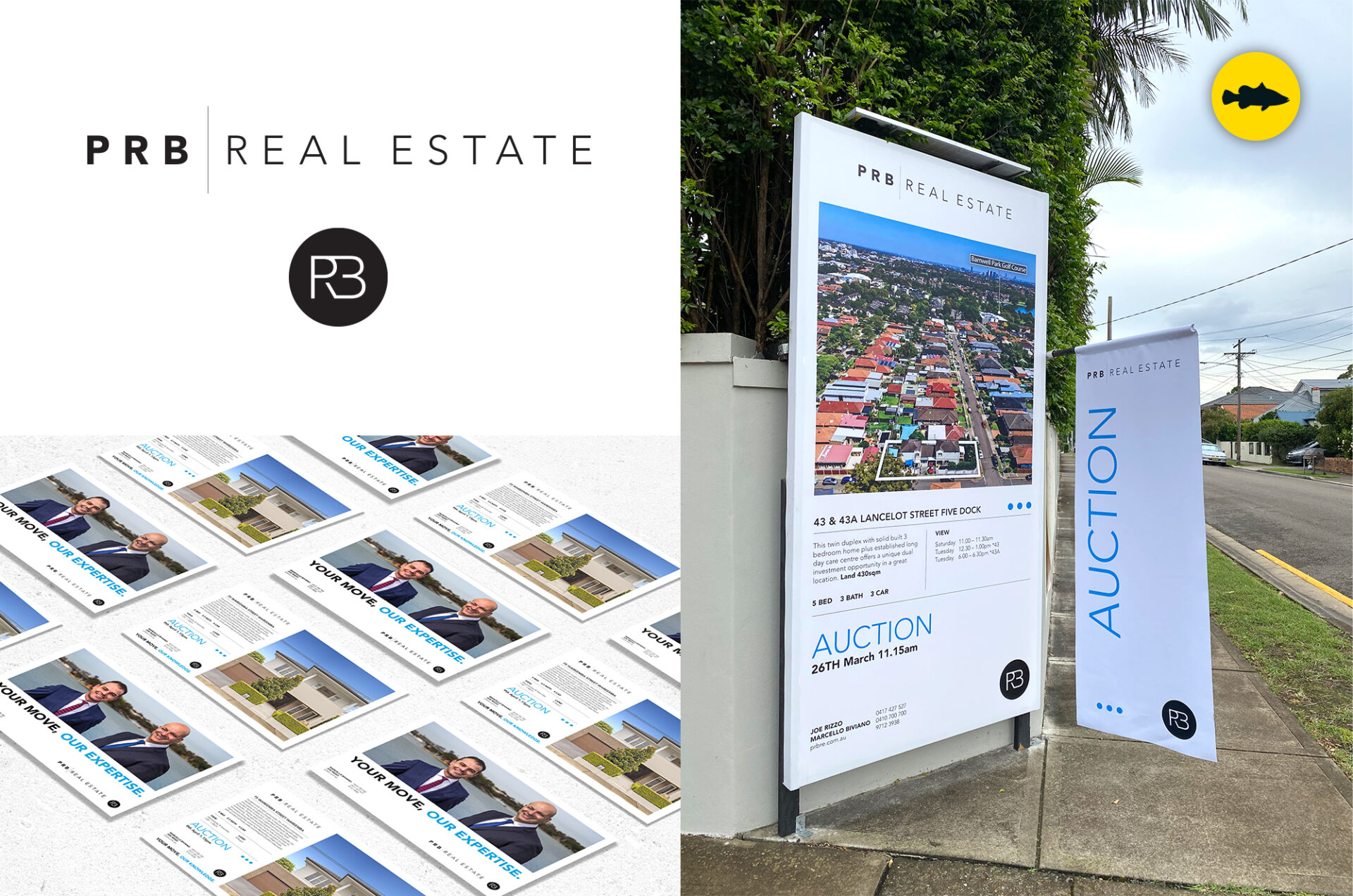
As graphic designer of choice for PRB Real Estate since its inception in 2011, Funky Barramundi continues to drive the realtor’s brand evolution.
This latest refresh delivers a crisp and classy edge to the brand as it matures. A refined logo features a thinner, contemporary font confidently applied in black for a premium finish.
This subtle, modern take streamlines the PRB Real Estate presence while retaining the signature blue accent. It has adapted readily to flyers, signboards, flags, A frames, stationery, adverts and online.
Tracing PRB’s brand evolution reflects the trust underpinning a decade-long professional partnership with Funky Barramundi.
“When we started PRB Real Estate we knew we needed to stand out as we are an independent business and we had to compete with the franchise and existing agencies. So, when it came to our Branding Funky Barramundi and Angelo where our first choice. He understood our brief and we have since refreshed our brand 3 times in the last 10 years with Angelo to continue to evolve. We appreciate all Angelo has done and look forward to our continued relationship”. Marcello Biviano | PRB Real Estate

