Coffee Capsules 2U
Loaded
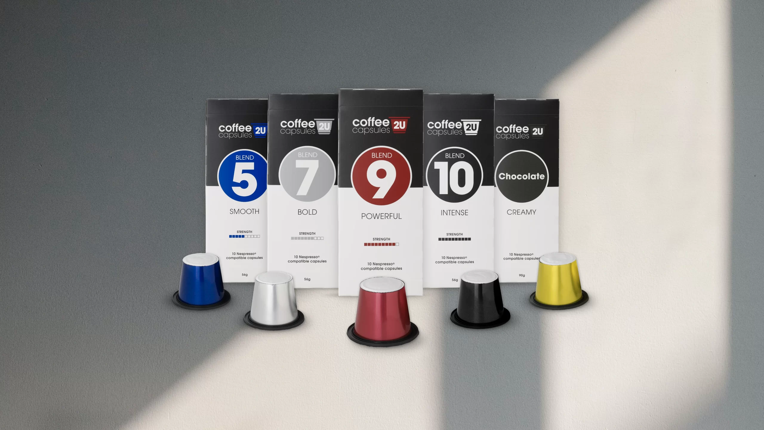
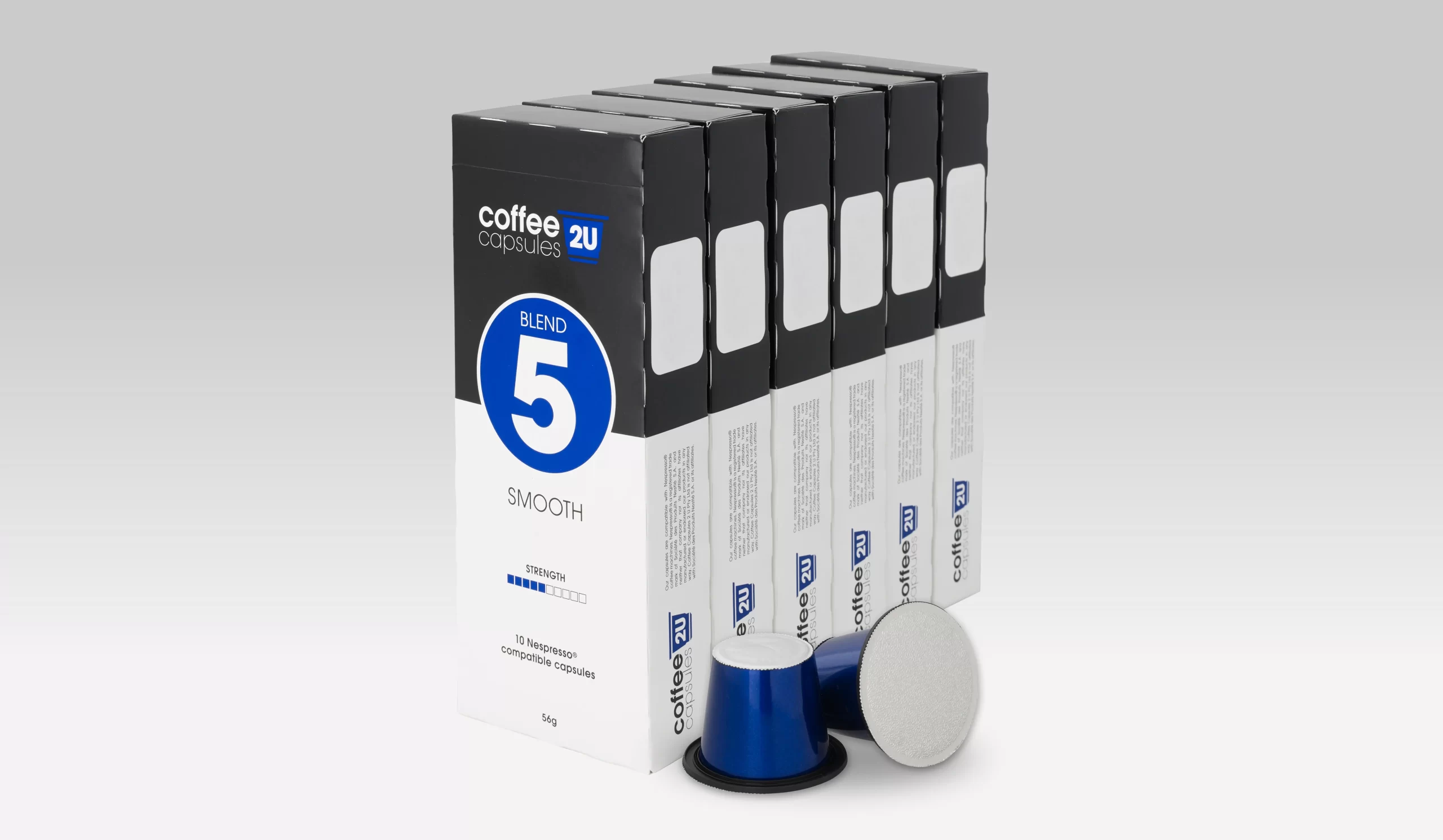
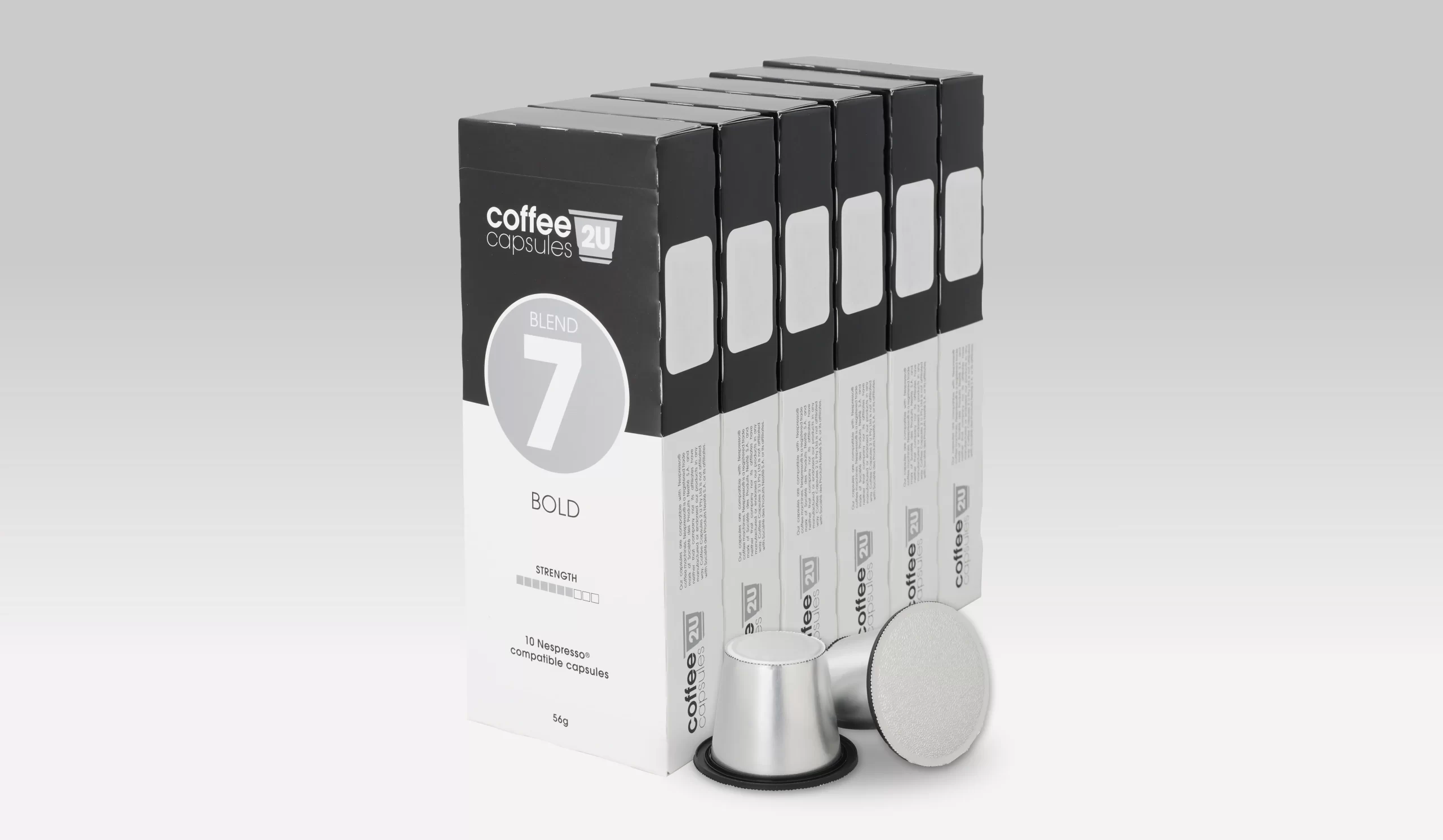
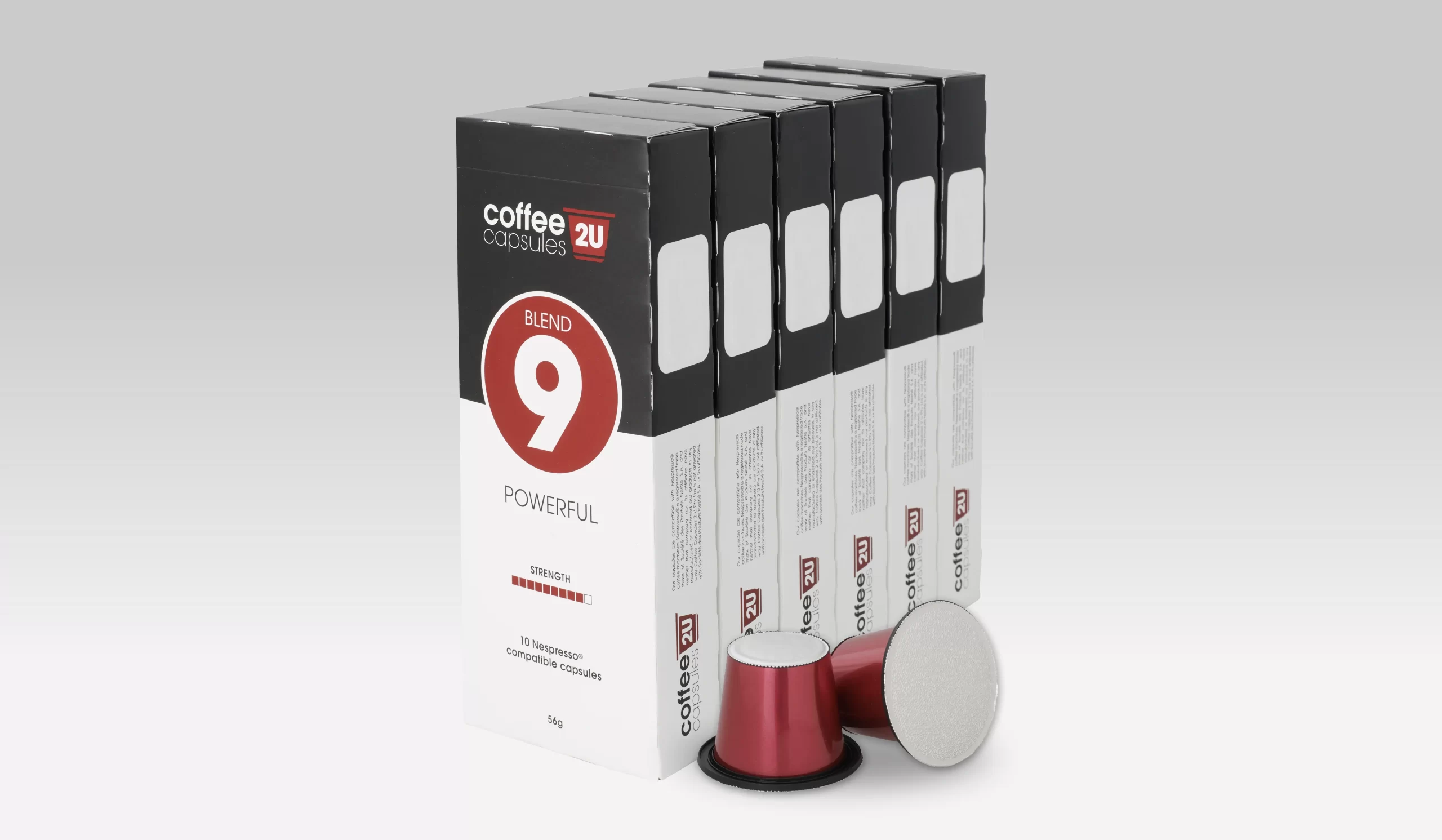
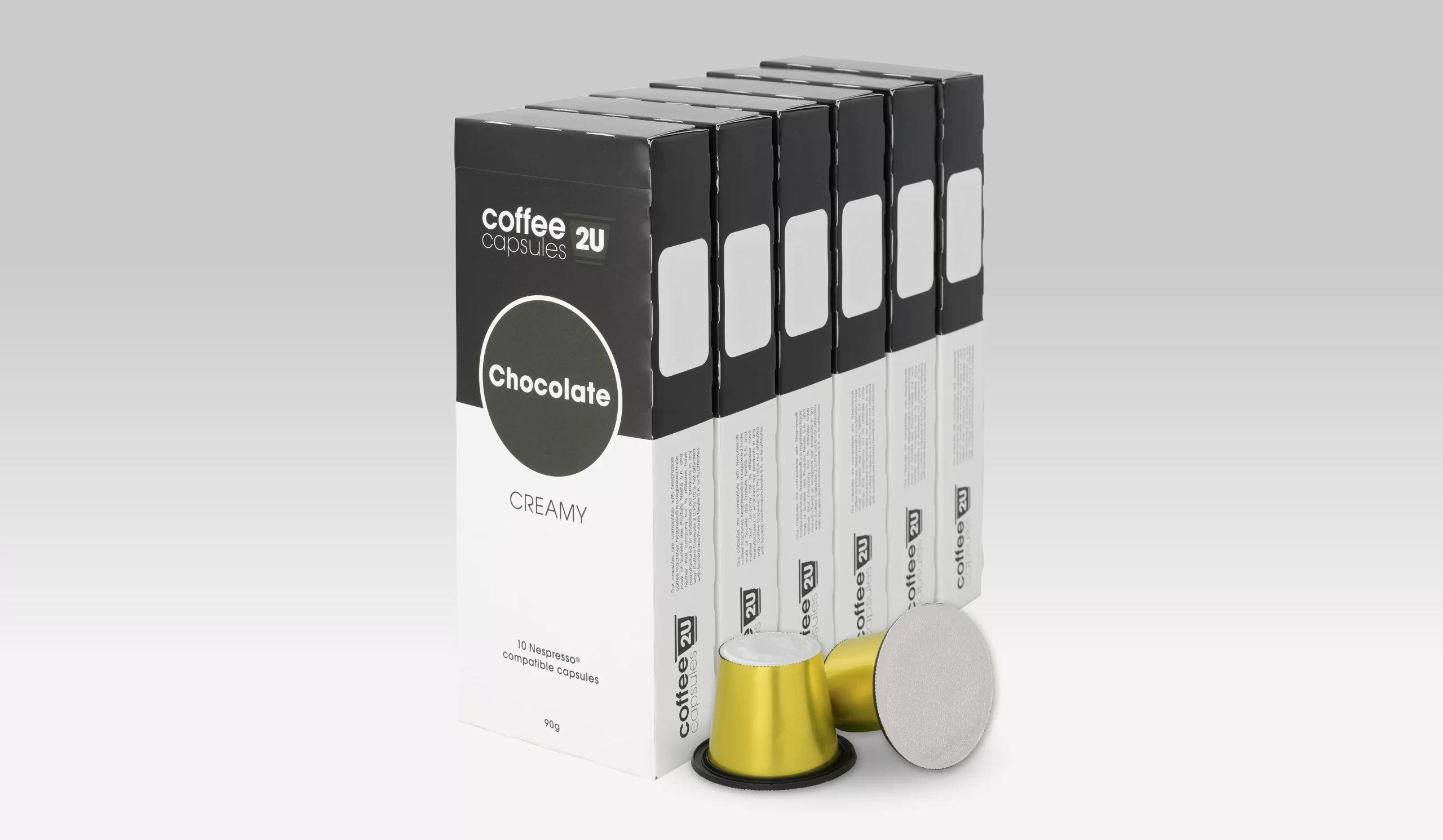
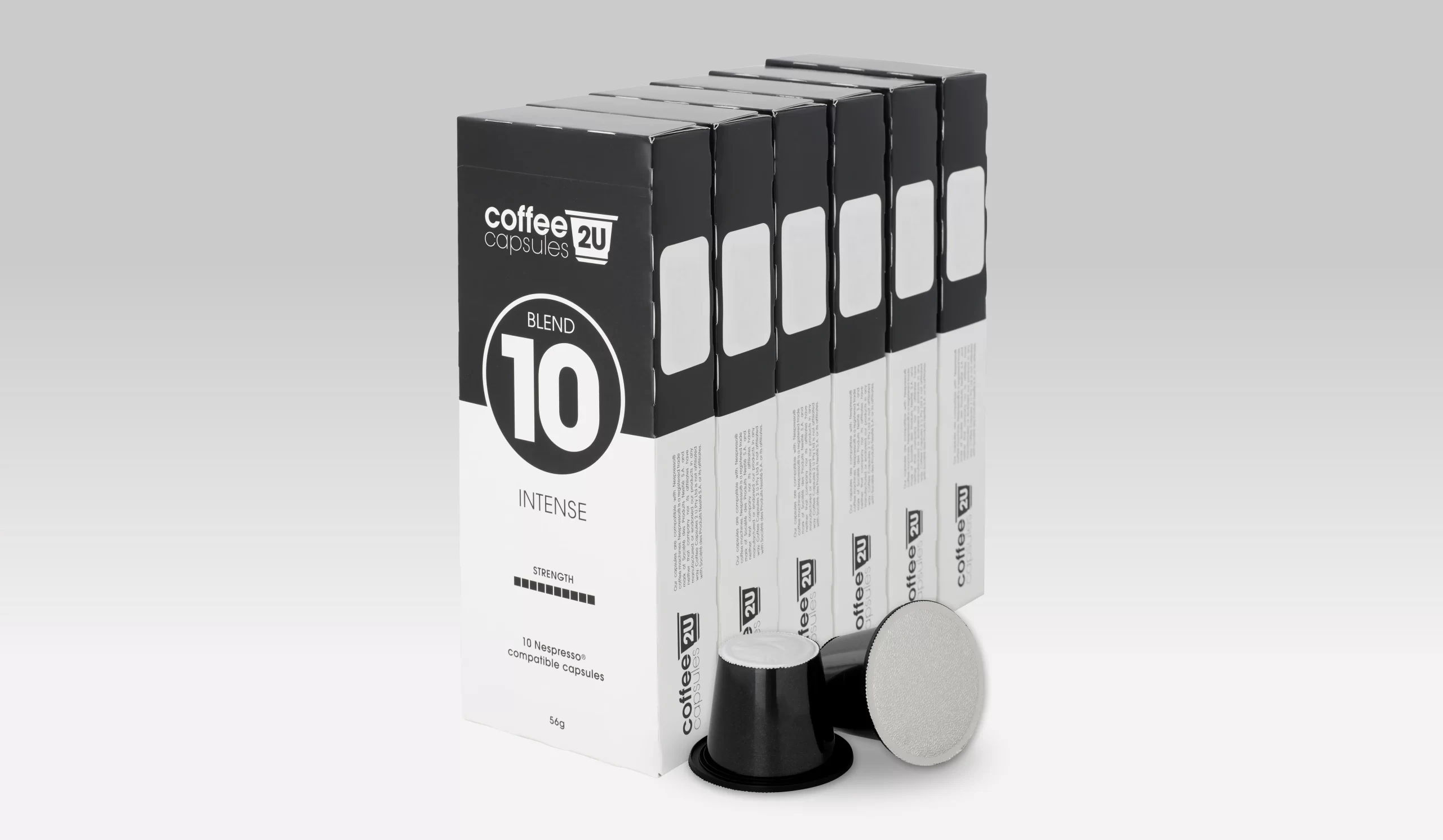
We think our striking result will have customers waking up to smell the coffee! Bold yet simple, our choice of strong typography and popping colour symbolises the flavour and intensity across the product range. Meanwhile, the coffee capsule motif tells the company story within the new statement logo. Our minimalist design solution packs a punch and delivers a result that’s both current and timeless. We’ll drink to that!
