GEN-TEC
Loaded
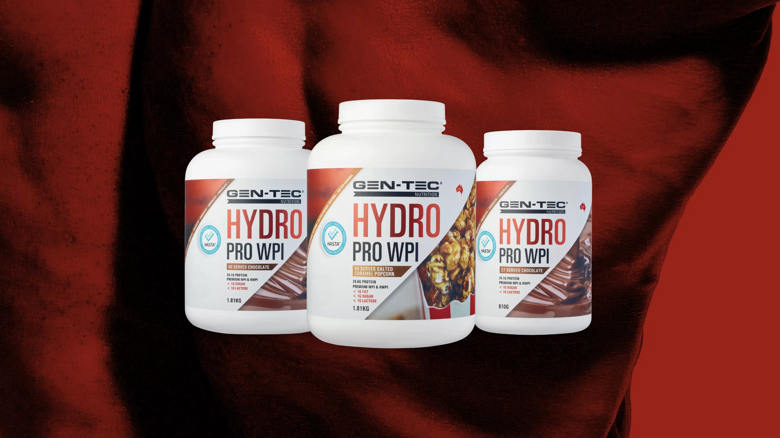
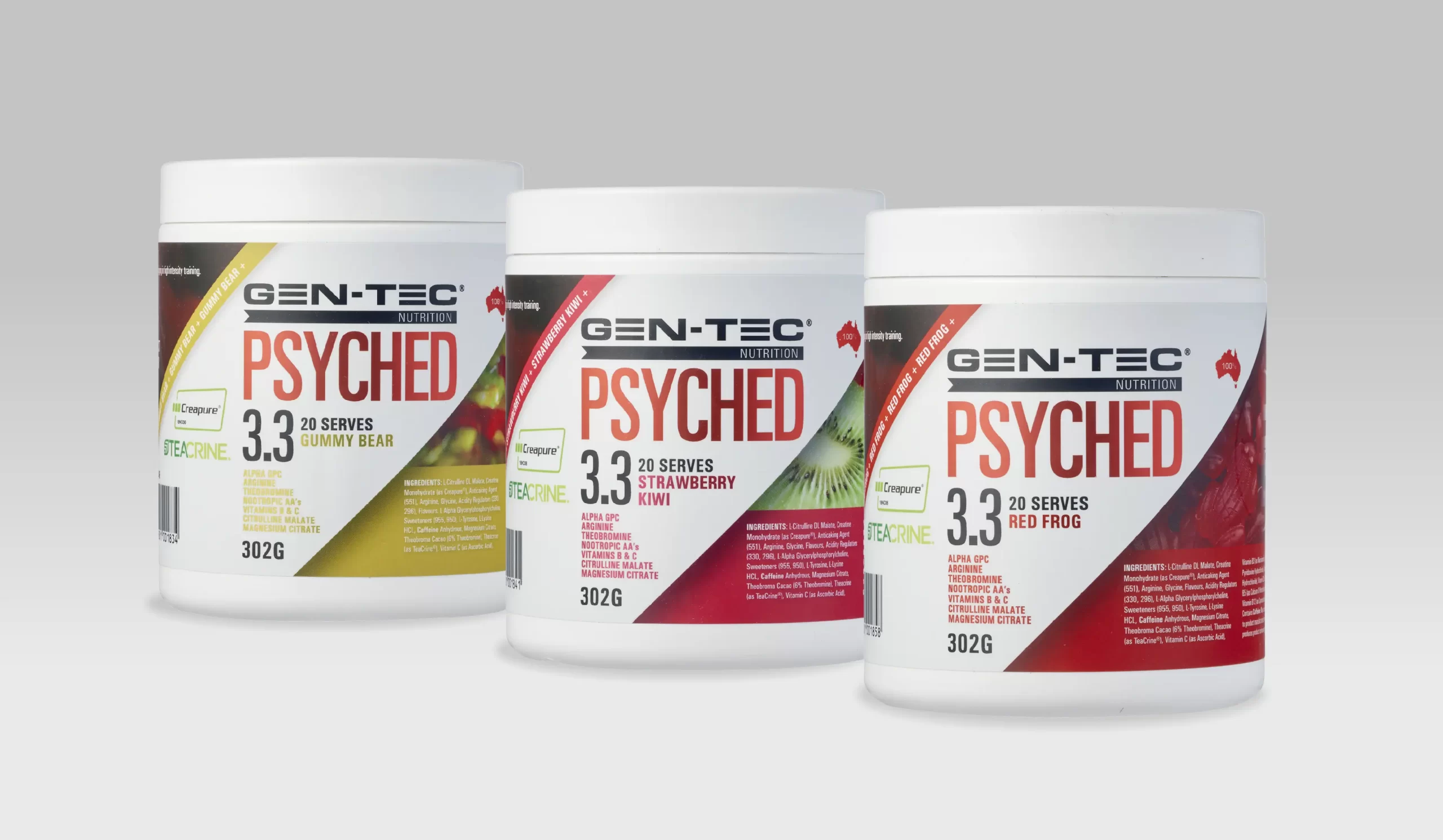
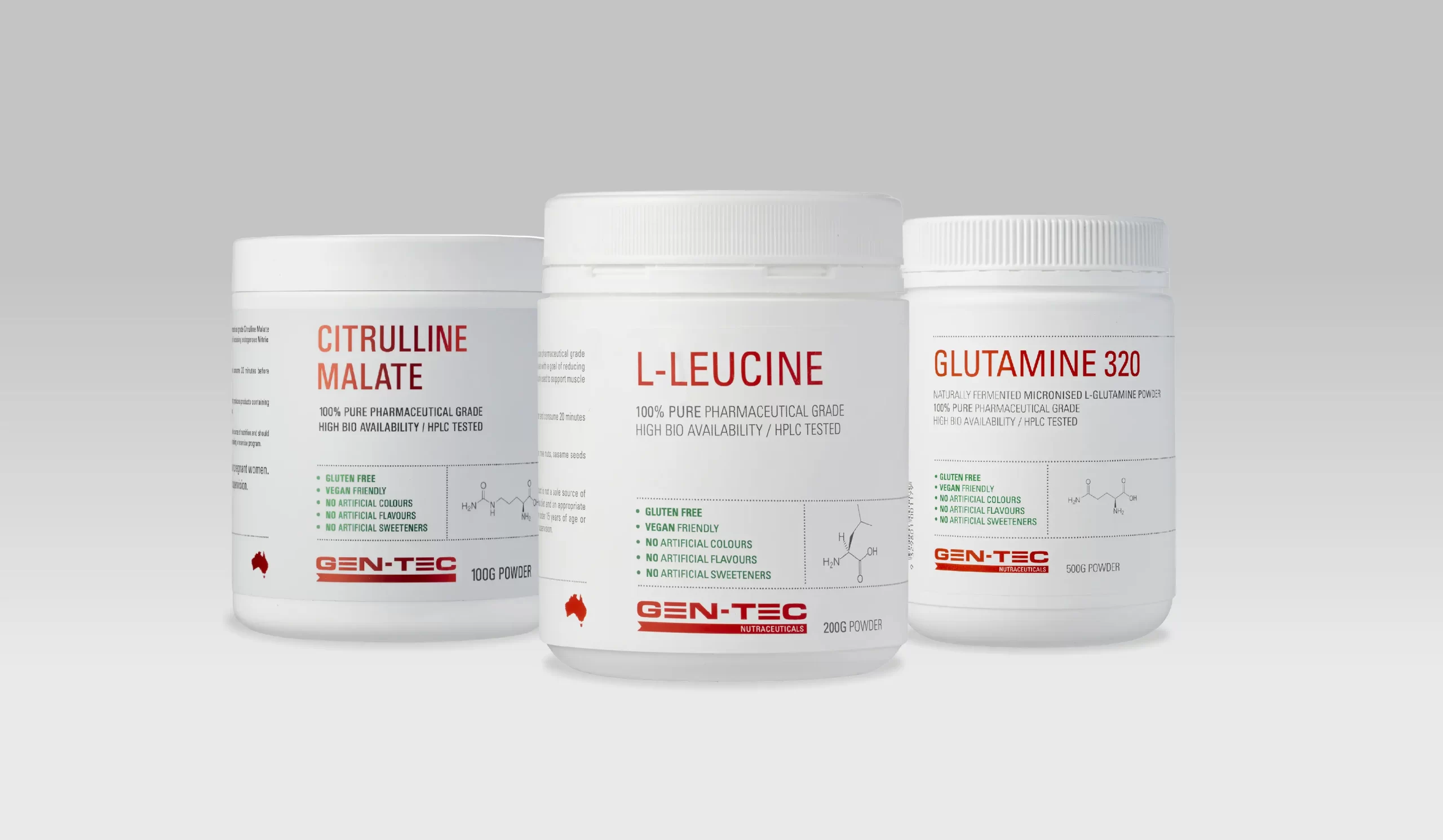
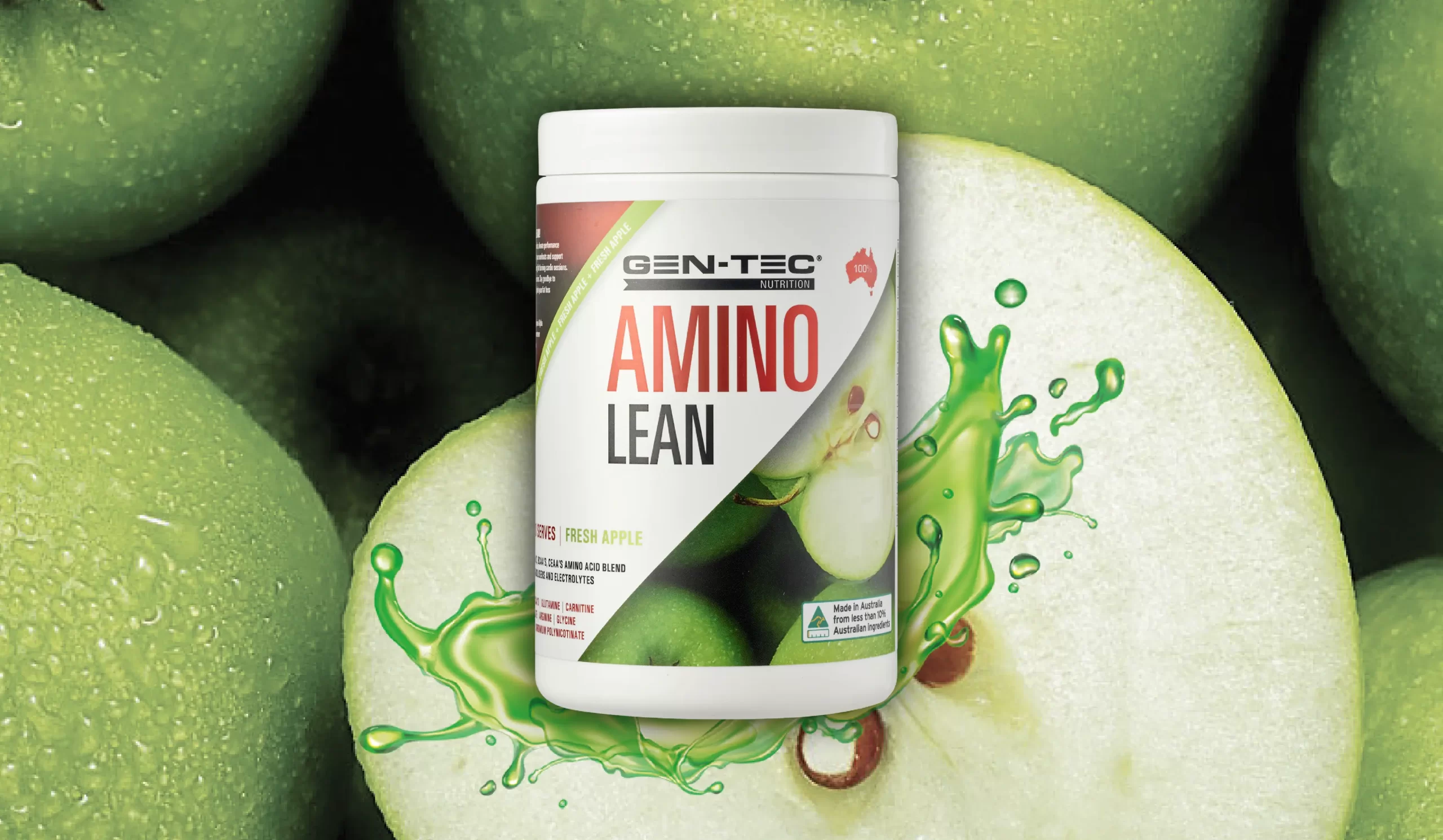
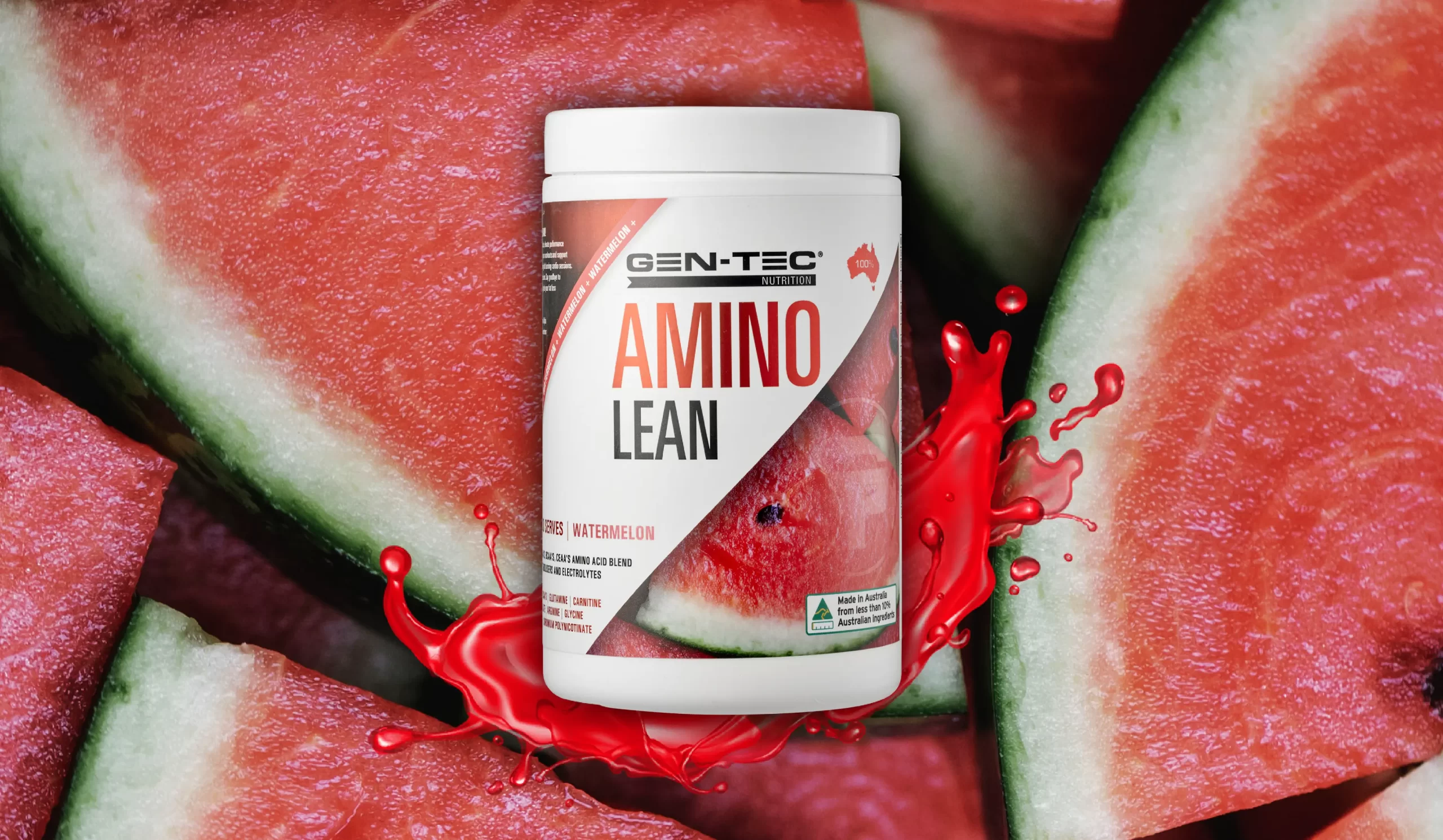
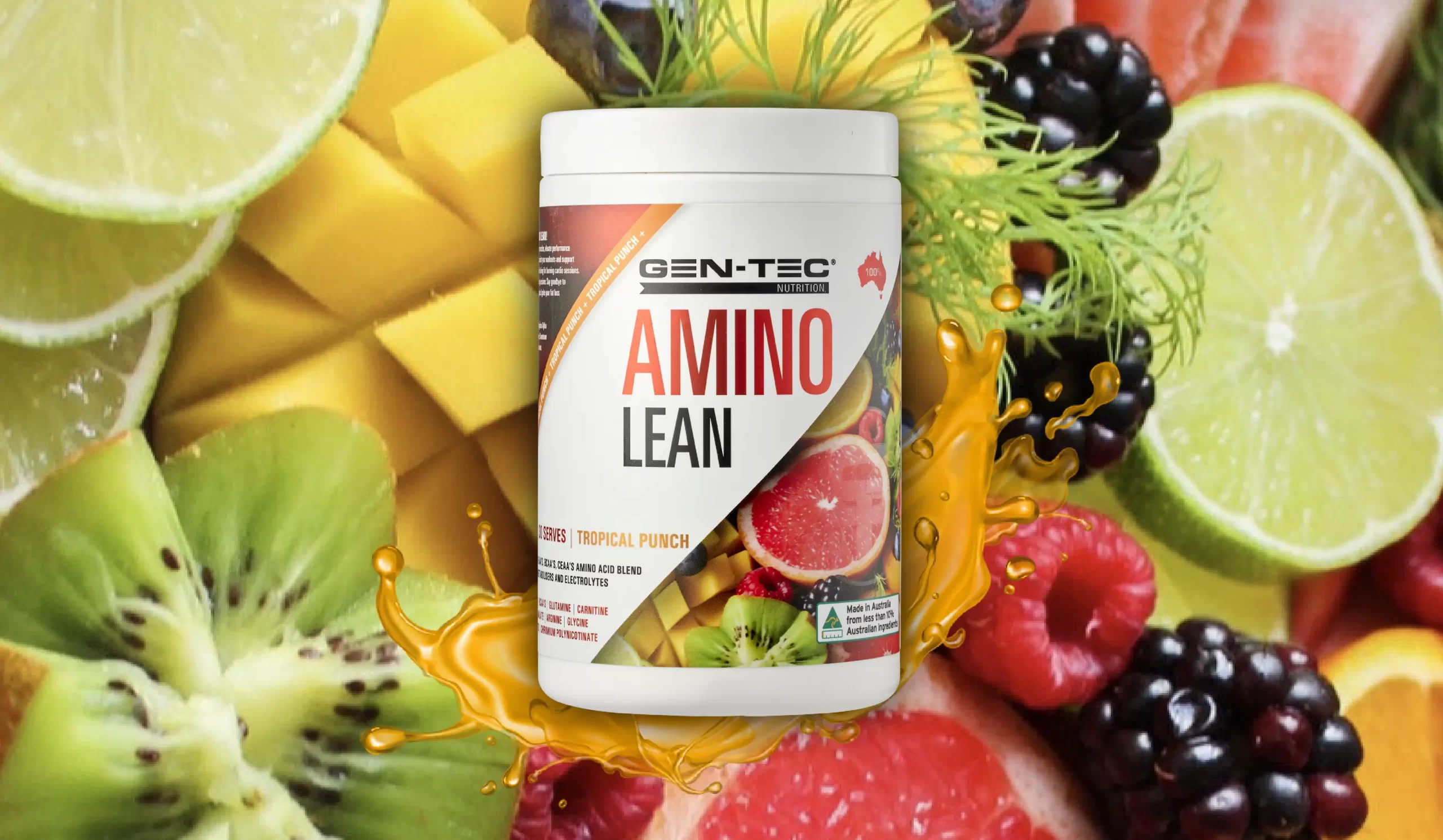
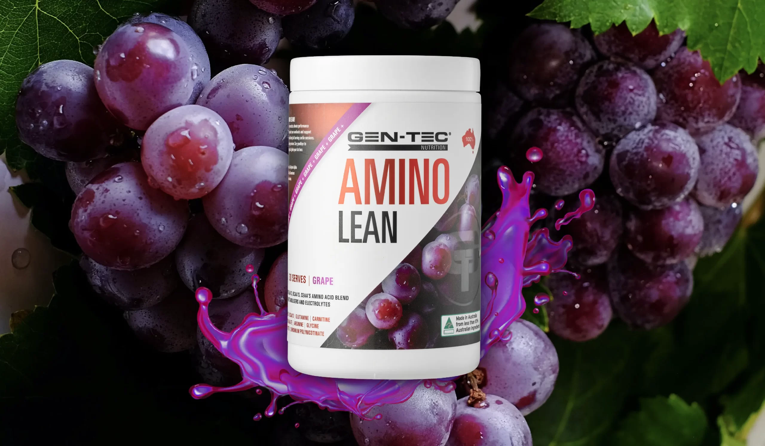
Our recent project with GEN-TEC was a perfect example of this challenge. The task at hand was to revamp the packaging of their products, maintaining the essence of the brand while ensuring they stood out on the shelves.
We delved into the roots of GEN-TEC, understanding its heritage and the loyalty it commands among Australian supplement enthusiasts. To give the packaging a modern and dynamic edge, we decided to focus on cleaner fonts, larger text, and a crisp design. The result was a brand new look that maintains the core identity of GEN-TEC but with a bold, contemporary twist.
Our design not only catches the eye but also respects the brand’s legacy.
